
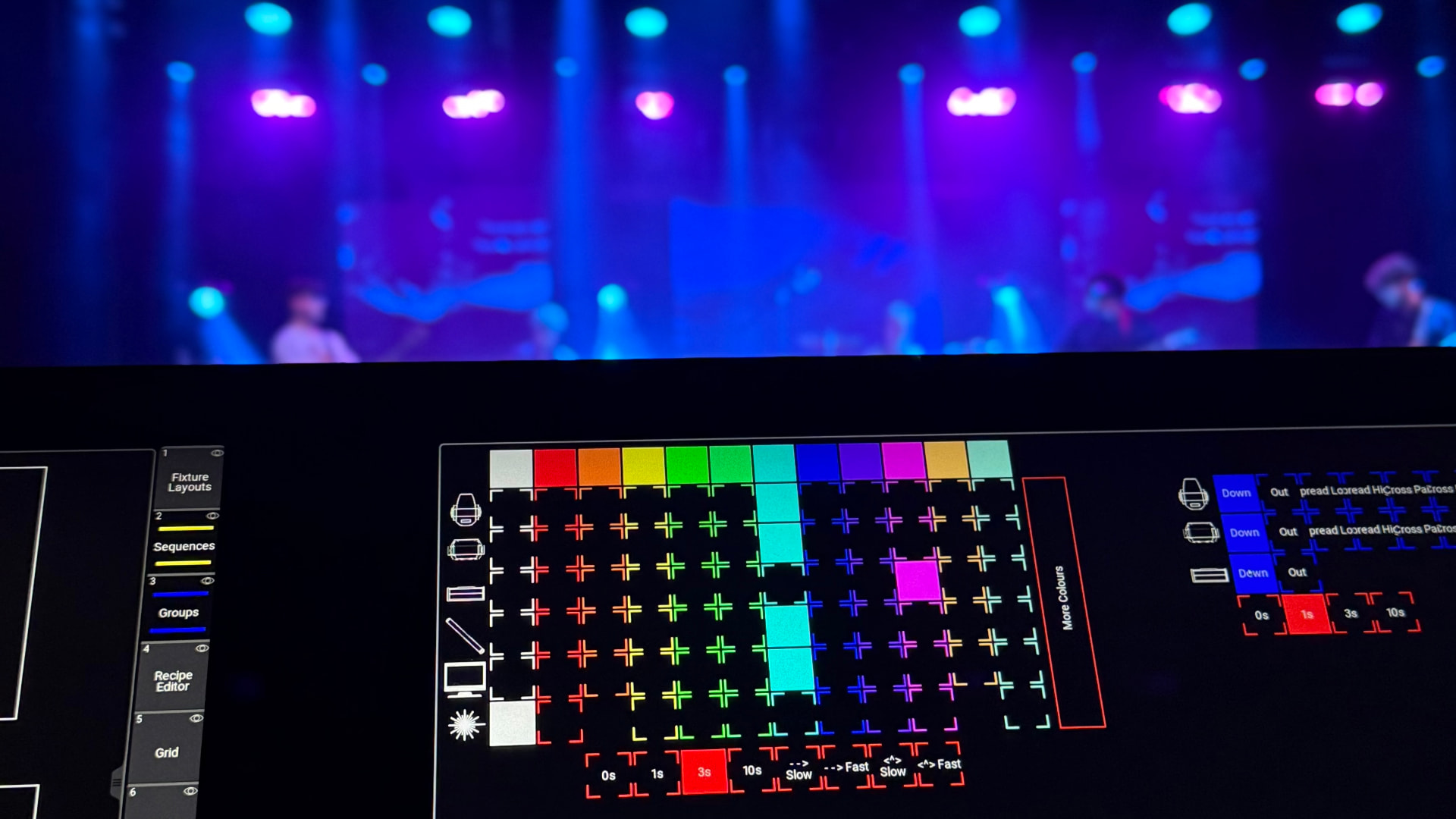
Colour Theory for Live Events: A Practical Guide
Colour will be one of the very first elements noticed by any audience before even one word has been uttered or note played. Colour will be far more than just decoration when working with live events. Colour creates mood, directs attention, establishes branding, and tells a story. Whether you are working with moving lights, using gels or planning an entire festival backdrop, an understanding of colour theory can provide you with an informed approach.
This guide covers the fundamentals of colour theory and shows how to apply them to lighting, stage design and event branding.
The colour wheel basics
Most colour theory starts with the colour wheel. For light, which is what stage lighting, LEDs and projection use, the primary colours are red, green and blue. These cannot be mixed from other colours of light. Blend two primaries and you get the secondary colours: red and green make yellow, green and blue make cyan, and red and blue make magenta. Blend all three together and you approach white. This is the additive colour model.
If you learned the colour wheel with red, yellow and blue, that version is for pigments and paints. Printers use cyan, magenta and yellow. For live events, the additive RGB model is the one that matters, because you are working with light rather than ink.
Blend a primary with a neighbouring secondary and you arrive at the tertiary colours, such as red-orange or blue-green.
The wheel is also split into warm and cool halves. Reds, oranges and yellows feel energetic, urgent or intimate. Blues, greens and purples feel calm, spacious or technical. Neither side is better; the trick is knowing which temperature suits the moment. A corporate keynote might lean cool and crisp, while a gala dinner might lean warm and inviting.
Harmony rules
Harmony describes how colours work together. There are four common rules that cover most design decisions:
Complementary colours sit opposite each other on the wheel. In the additive RGB model used for light, the classic complementary pairs are red and cyan, green and magenta, and blue and yellow. They create the strongest contrast and visual energy, which makes them useful for highlighting a speaker, a product reveal or a dramatic shift in a performance.
Analogous colours sit next to each other. Blue, blue-green and green, for example, create a calm, unified look. This approach is ideal for ambient washes, brand environments, or any scene where you want colour to support the mood without stealing attention.
Triadic schemes use three colours evenly spaced around the wheel, such as red, green and blue. They are vibrant and balanced but can feel busy if all three are used at full saturation. A common tactic is to let one colour dominate and use the other two as accents.
Monochromatic schemes use a single hue in different tints, shades and tones. A deep navy stage fading into pale blue haze feels sophisticated and controlled. Monochrome is forgiving and often the safest choice when you need elegance without complexity.
Colour psychology
Colours carry associations that vary by culture, context and personal experience, but some patterns are broad enough to be useful. Red suggests passion, urgency or danger. Blue suggests trust, clarity and technology. Green suggests nature, growth and balance. Yellow suggests optimism and warmth. Purple suggests luxury, creativity or mystery. Orange suggests energy, friendliness and affordability.
In live events, these associations help reinforce the message. A tech product launch might use cool blues and whites to feel precise and modern. A charity gala might use deep reds and golds to feel emotional and prestigious. The key is consistency: if your branding says calm and premium, a sudden saturated orange wash will confuse the audience.
Applying colour theory to lighting and stage design
Lighting is where colour theory becomes practical. Modern LED fixtures make it easy to dial in any hue, but that freedom can lead to muddy or unintentional results.
Start with a base wash in an analogous or monochromatic scheme. This gives the stage a coherent foundation. Then add complementary accents for key moments: a solo, a speaker entrance, or a product spotlight. Keep triadic schemes reserved for high-energy moments where visual excitement is the goal.
Pay attention to skin tones. Some colours, especially saturated greens and magentas, can make people look unwell on camera. A warm amber or soft pink tends to be flattering for faces. If your event is being filmed or live-streamed, test your palettes on real people before the show.
Consider the surfaces you are lighting. A white wall reflects colour cleanly, while a dark curtain absorbs it. A glossy floor can create reflections that double your colour choices, for better or worse. Walk the room, look at the stage from multiple angles, and adjust.
Accessibility and readability
Colour choices affect whether information is readable. Projected slides, signage, and video content all rely on contrast. Light text on a dark background is usually easier to read under stage lighting than dark text on a light background, but the real test is the contrast ratio. A pale yellow on white will fail; a bold white on deep blue will pass.
Avoid relying on colour alone to communicate meaning. If status indicators use only red and green, audience members with colour-vision differences may miss the message. Add labels, icons or patterns to make the information clear to everyone.
Common mistakes
One of the most common mistakes is using too many saturated colours at once. When every fixture competes for attention, the stage looks noisy and cheap. Choose a limited palette and let one element lead.
Another mistake is ignoring the existing environment. Venue house lights, wall colours, and daylight through windows all affect how your colours read. A palette that looks perfect in a dark studio can look washed out in a white conference room.
Finally, do not forget about colour temperature in white light. A "white" can range from warm candlelight to cool daylight. Mixing warm and cool whites without intention can make the stage look uneven and unprofessional.
Quick reference
- Use the colour wheel to find relationships between hues.
- Complementary pairs create contrast and energy.
- Analogous and monochromatic schemes create calm and cohesion.
- Triadic schemes are vibrant but need a clear dominant colour.
- Match colour temperature to mood and brand.
- Test skin tones and camera rendering before the show.
- Ensure contrast for text, slides and signage.
- Limit your palette and let one colour lead.
Bringing it all together
Colour theory is not a set of rules to follow blindly. It is a language for making deliberate choices. The best event designers know when to follow harmony and when to break it for effect. Start with the basics, build a small palette, and test it in the real world. Over time, choosing colours becomes faster, more confident and more expressive.
At Backline, we believe the details behind great events should be easy to manage. From lighting notes to stage schedules, having your production information in one place means you can spend less time searching for paperwork and more time crafting the look and feel of your show.